Design System and Product Content Revamp: Auditing, Standardization, Governance
Role
Senior Content Strategist
Content and design system auditing, UX writing, content governance, content standards
Collaboration
UX lead
UX designer
Senior content designer
Client
Lift Truck Manufacturer
Timeline
Phase One: Oct 2023-Jan 2024
Phase Two: Feb 2024-March 2025
Tools
Miro
AirTable
Excel
Teams
Knapsack
Figma
The problem / context
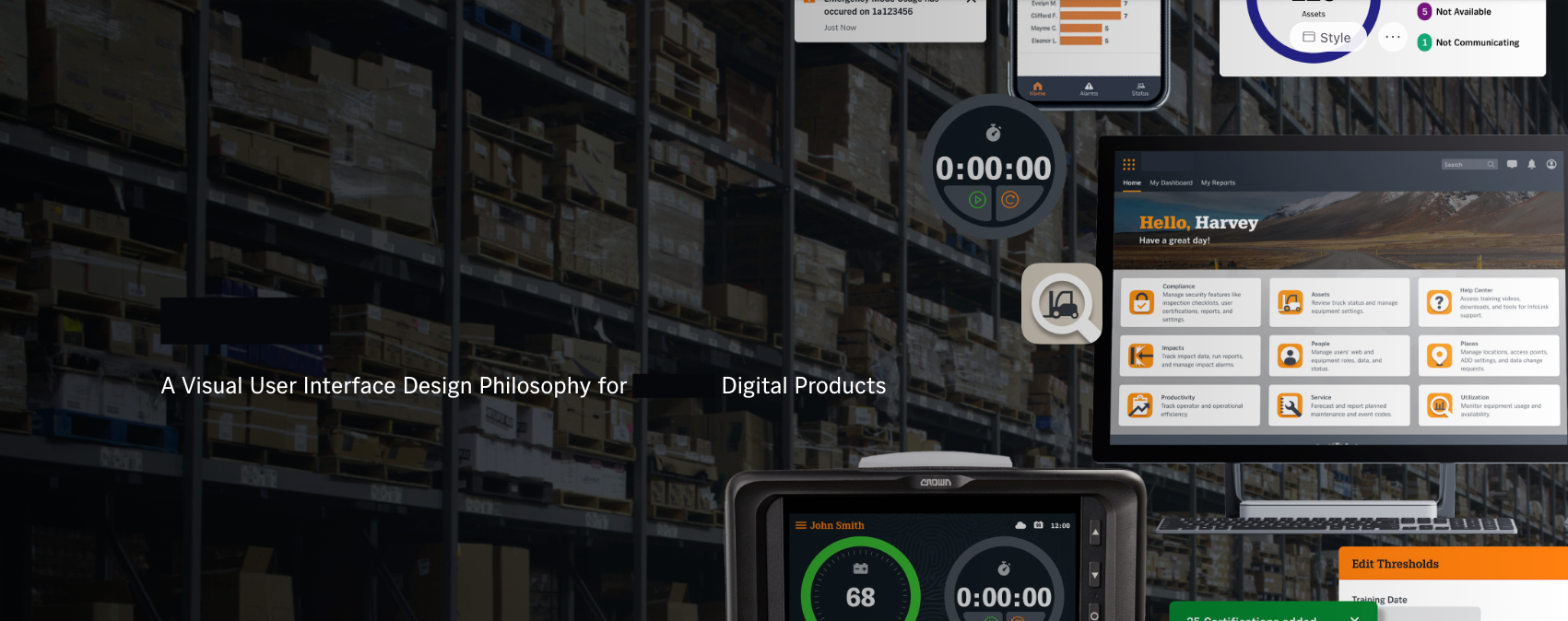
A leading forklift truck manufacturer needed to improve the UI and UX of their lift truck software. Their internal teams knew improvements were needed but lacked a clear direction on where to prioritize efforts.
The core issue stemmed from their design system: it was disorganized, and the documentation was disparate and scattered across multiple platforms. This lack of a single source of truth led to:
Inconsistent user experiences across their software platform
Inefficient workflows for designers and developers, who struggled to find the right components or guidance
A dated look and feel that didn't align with modern UX best practices or their brand standards
Heads up! This is a two-part case study. So, if you’d like to jump to a phase:
Phase one work: audits and strategic recommendations
As part of a four-person team (a UX lead, a senior UX designer, and a senior content designer), I helped perform a series of comprehensive audits to diagnose every issue and identify opportunities.
My primary focus was on the content and information architecture of both the design system and the end-user software.
Audits for days
Software Content Audit: I inventoried the live software platform to identify inconsistencies in terminology, voice, error messaging, and button labels.
Design System Audit: I analyzed all existing documentation, noting where content was unclear, missing, or contradictory.
Accessibility & Heuristic Audits: Working with the team, I helped evaluate the platform against WCAG criteria and usability heuristics, specifically noting where content (like missing alt-text or unclear link copy) created accessibility barriers.
Platform IA Audit: I mapped out the current information architecture of the product to understand how the pages related to each other and how users navigated from page to page.
Stakeholder interviews
Along with auditing the design system and product, we also spoke with several company stakeholders.
Findings and recommendations presentation
Using these findings, we created a readout presentation with a prioritized backlog of UX improvement recommendations, which the client approved for execution. The audience was stakeholders and company executives.
Findings from our presentation included:
Incomplete Brand Standards: Design system lacks detailed information about the company’s brand and values, audience, and communication standards.
Absent Content Usage Guidelines: Both the product and design system contain inconsistencies in word usage, formatting, capitalization, and punctuation.
Lack of Plain Language Standards: The design system’s documentation stresses the importance of plain language but fails to explain it. The system itself contains more complex sentences that need simplification.
Placeholder Text Acting as Element Label: Some search bars and form inputs lack labels and rely on disappearing placeholder text to describe the element or provide instructions.
Product Instructions Lack Clarity or Helpful Context: Instructional language in the product doesn’t always match the user’s intended action or properly guide the user to their destination.
Dispersed and Unmanaged Documentation: Scattered documentation without established ownership creates several issues, from knowing where to find documents to losing version control.
Based on the findings, we divided our recommendations into five themes:
Centralize Standards and Documentation
Build Processes to Reduce Inconsistencies
Create Consistency in Navigation and System Clarity
Provide Contextual and Available Help
Streamline Inconsistent and Cumbersome Processes
Then, we broke those themes into three levels of priority to help guide next steps:
Quick wins
Longer-term efforts
Strategic initiatives
This all set the stage for phase two, which focused on creating and improving design system documentation and standards.
Phase two work: design system documentation and migration
During this second phase, it was full steam ahead, carrying out our recommendations based on phase one’s analysis.
My contributions:
Foundational content standards throughout the entire design system, including a new style guide, standards for voice and tone, and practical UX writing tips to guide designers and developers
Clear, consistent, and accessible content guidelines for critical system components, such as buttons, banners, and error messages
Clear file storage, governance documentation, and workflows so the internal team could maintain the system long-term
Training for the client's internal teams, teaching them how to use the new design system, standards, and workflows effectively
The editing and creation process
The client’s original design system was housed in Figma. We started there, editing page-by-page.
We also added content standards to each component to ensure standardization and consistency across the product.
As the content designer and I worked, I kept a running list of standard guidelines to include in two new style guides:
One style guide for the writing within the product
Another style guide for design system documentation best practices
Based on conversations with the client’s design team during phase one, we chose four design system platforms to evaluate:
Storybook
Zeroheight
Supernova
Knapsack
Choosing a new design system platform
We scheduled demos of each and evaluated the features. Each person from the design, development, and content teams rated each platform, and we compiled the ratings in Excel for comparison.
And the winner was… Knapsack!
So, once our Figma pages were edited and standardized, we started migrating them to Knapsack. We used Excel to assign, track, and comment on pages as we migrated them.
Here’s an example of a component page in the new Knapsack platform:
And the Style Guide, Word Usage, and Brand Guidelines pages:
Documentation centralization
Meanwhile, I was also helping the client create a more centralized location and process for their product development documentation. This included:
Interviewing teams involved in the SDLC
Evaluating current documentation storage and practices
Creating new standards for folder/file structures, workflows, and the governance process
The outcome: efficiency, consistency, and prioritization
This content-led overhaul provided the client with a stable and scalable foundation for all future product development.
For the business: The client now has a prioritized roadmap for software improvements and a clear governance plan, preventing future disorganization and saving design/development time.
For internal teams: Designers and developers finally have a single source of truth. The clear content standards and component guidelines empower them to build faster and with greater consistency.
For the end-user: The new standards ensure a more cohesive, accessible, and user-friendly experience for the operators using the lift truck software.